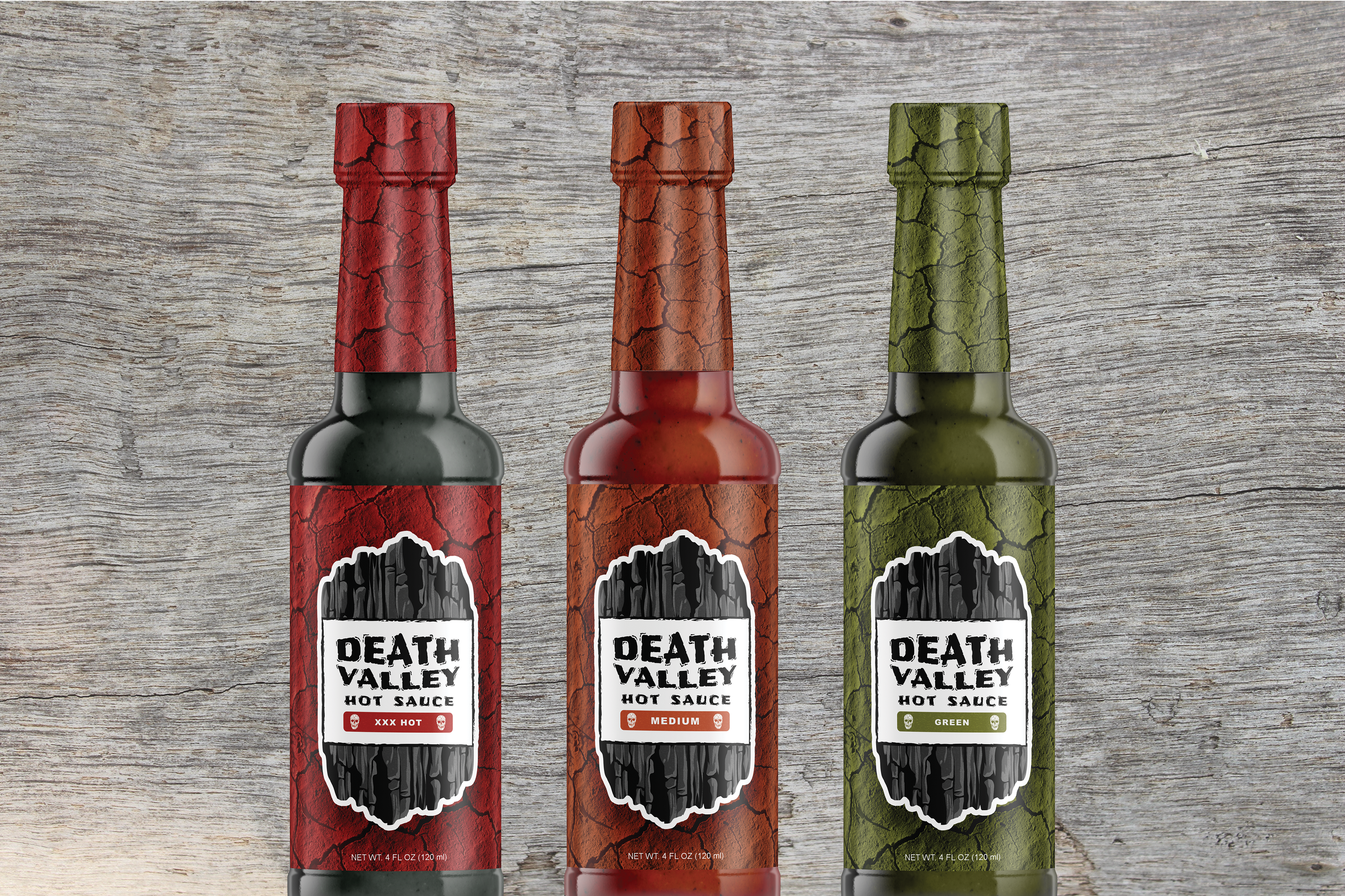
DEATH VALLEY HOT SAUCE
Packaging // Branding
2017
Packaging // Branding
2017
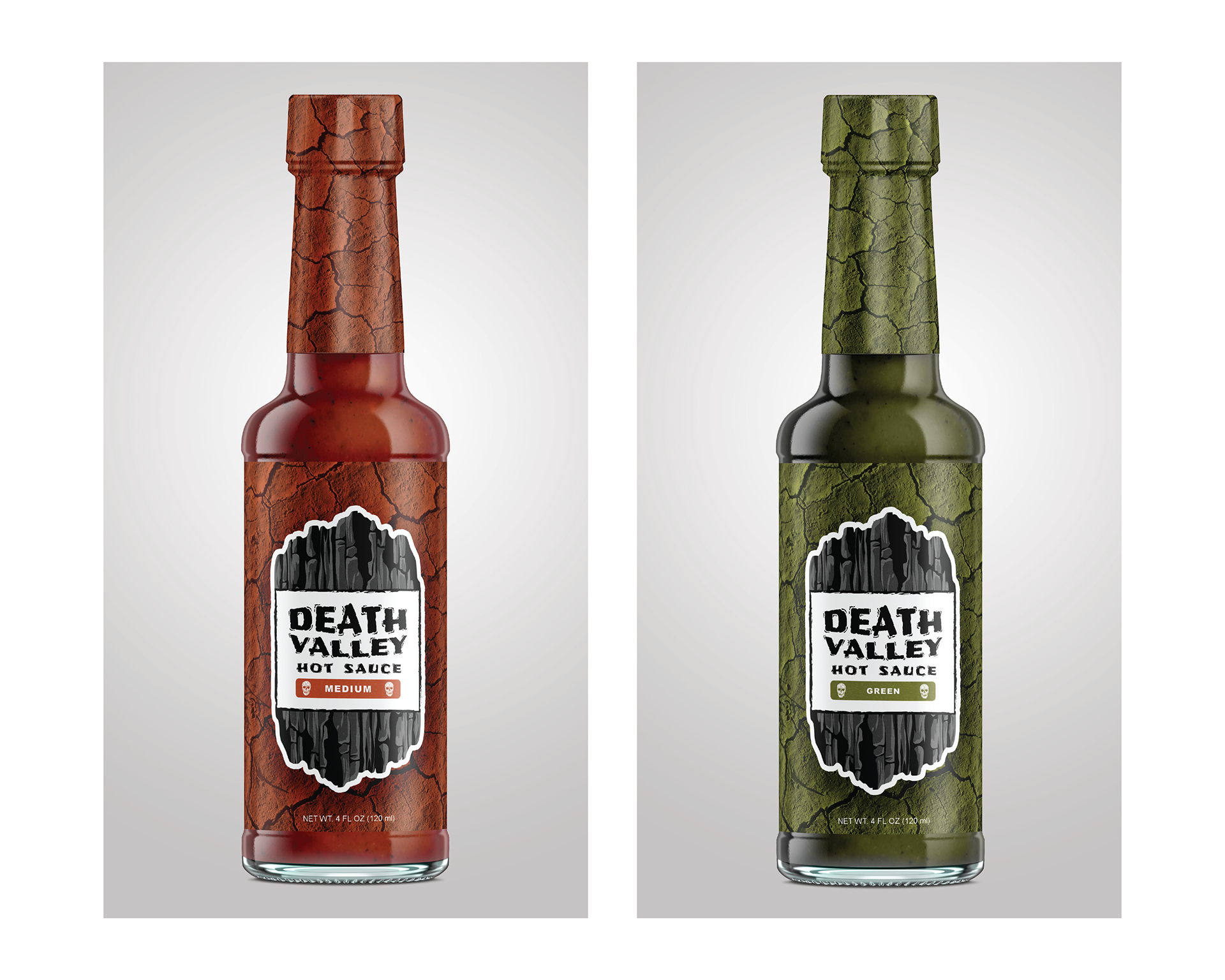
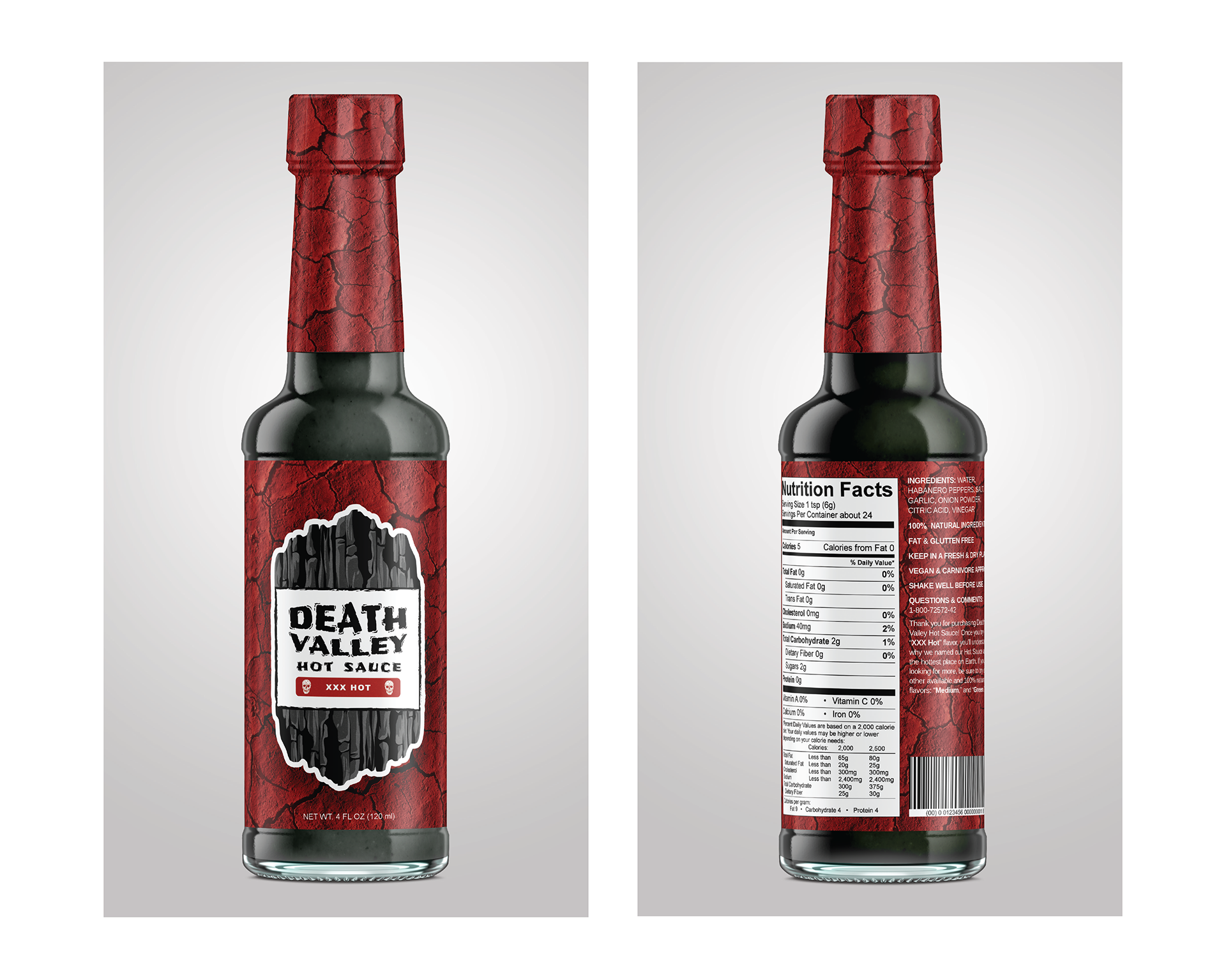
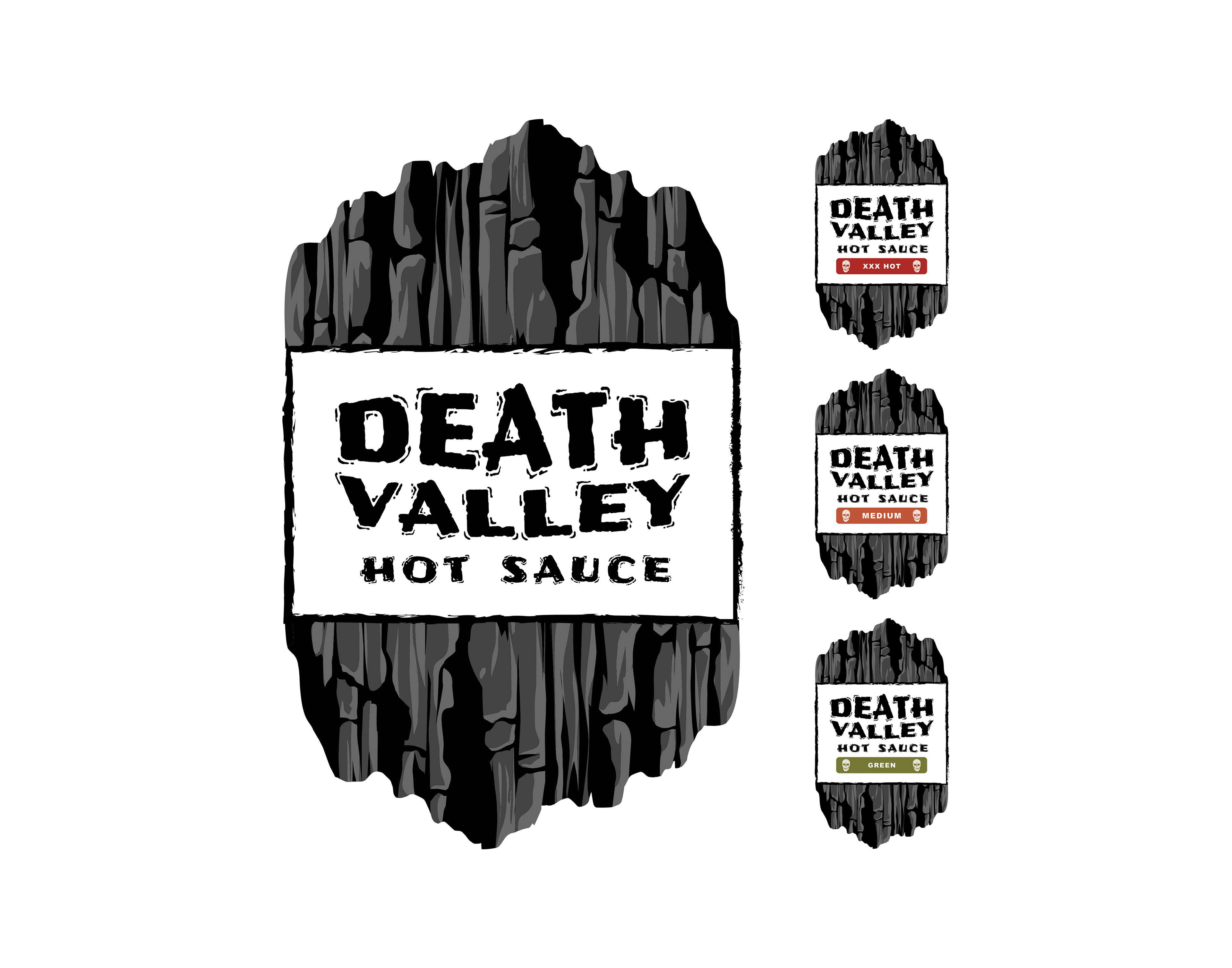
Death Valley Hot Sauce is a new and upcoming brand that sells high quality hot sauce with three available flavors: “XXX Hot,” “Medium,” and “Green.” The brand is named after Death Valley: the hottest, driest, and lowest national park with record summer heat making it a land of extremes. Death Valley holds the record for the hottest air temperature ever recorded, which was 134°F.
Since the national park is the inspiration behind the brand name, the design elements are also inspired by Death Valley itself. The logo is built from an illustration of steep rocks, similar to the mountains surrounding the valley. The packaging for each of the bottles is an image of Death Valley’s famous cracked ground. The colors used for the packaging are bright and fun to represent the adrenaline rush that comes with consuming hot sauce. The colors change for each individual flavor, and although they are bright they still stick to an Earthy theme. The logo’s color scheme is grayscale in order to contrast with the colorful packaging as well as to coincide with the word “Death,” in “Death Valley.” The font used for “Death Valley Hot Sauce” is a decorative font that matches the illustration style of the logo. The font used for the flavors is simply a sans-serif which is meant to contrast the “rough” style of the logo and packaging.