

CONEHEADS
Identity
2019
Identity
2019
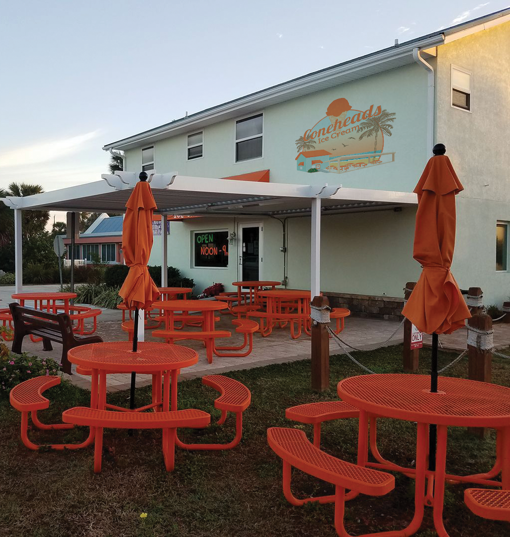
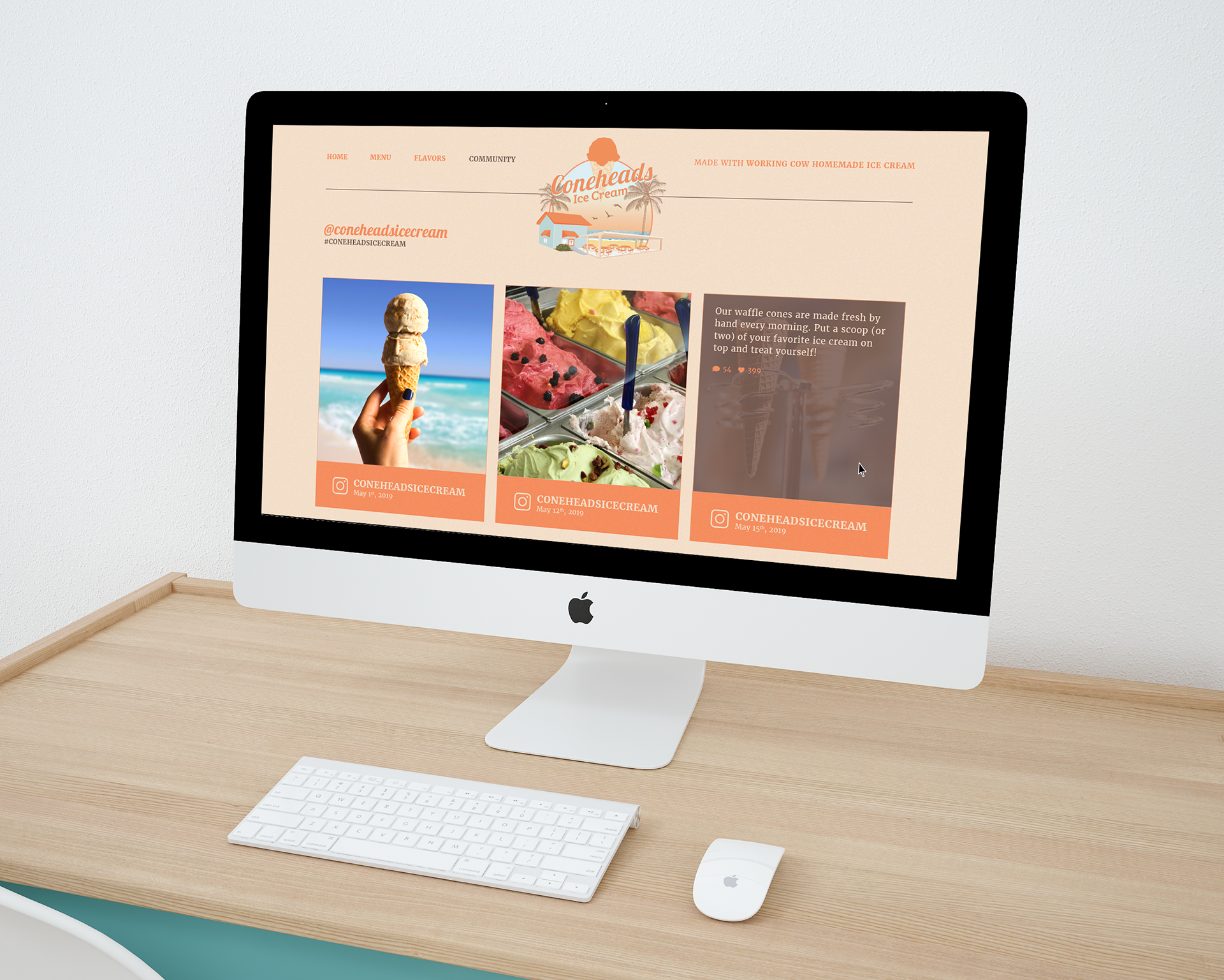
Coneheads is a full service dip shop located on St. Augustine Beach with 32 different ice cream flavors available to choose from. St. Augustine is very reliable on tourism: The St. Augustine, Ponte Vedra &The Beaches Convention and Visitors Bureau states that the rate for the first six months of hotel occupancy was 70.75% in 2017. So, it makes sense to target tourists.
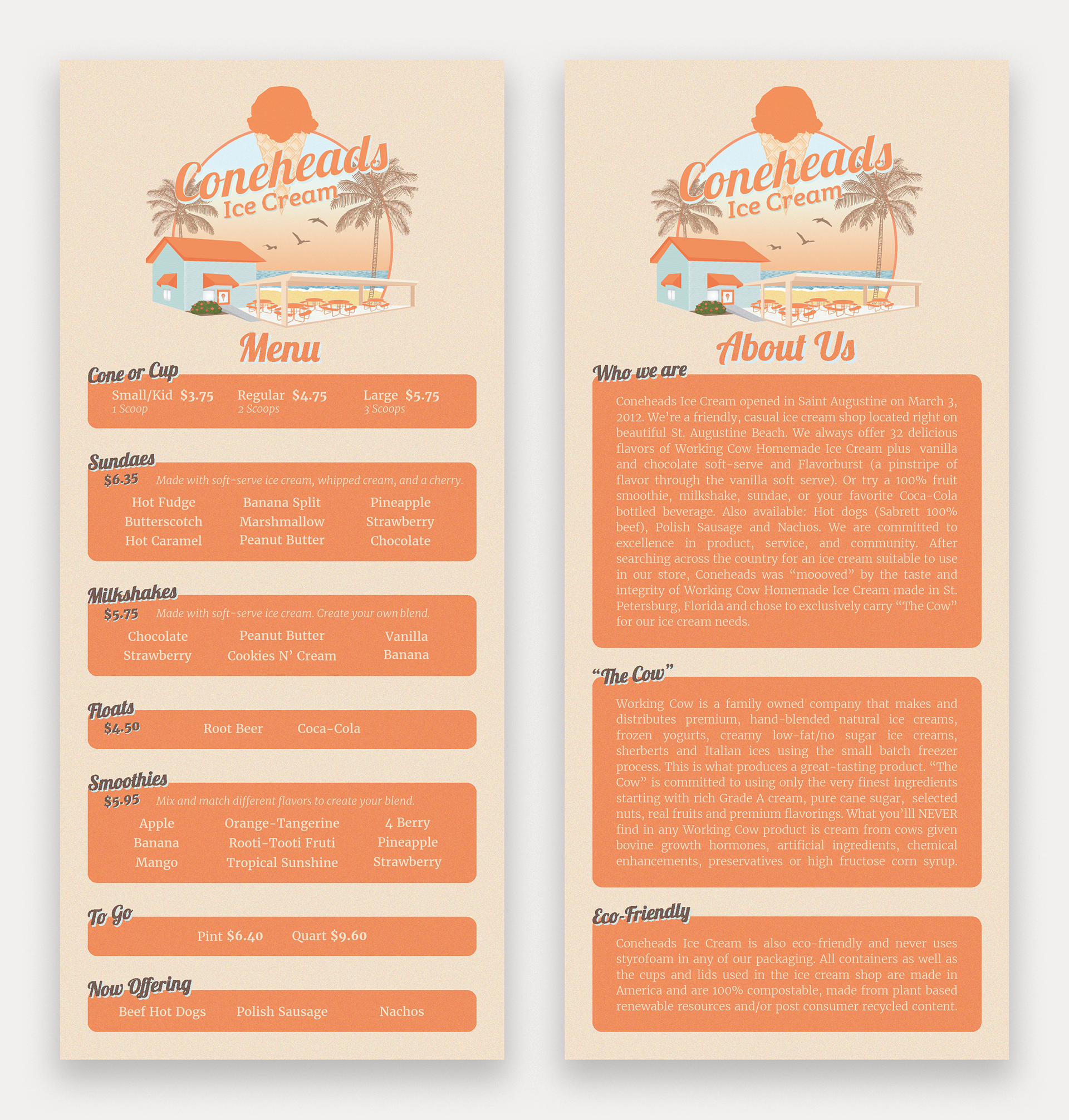
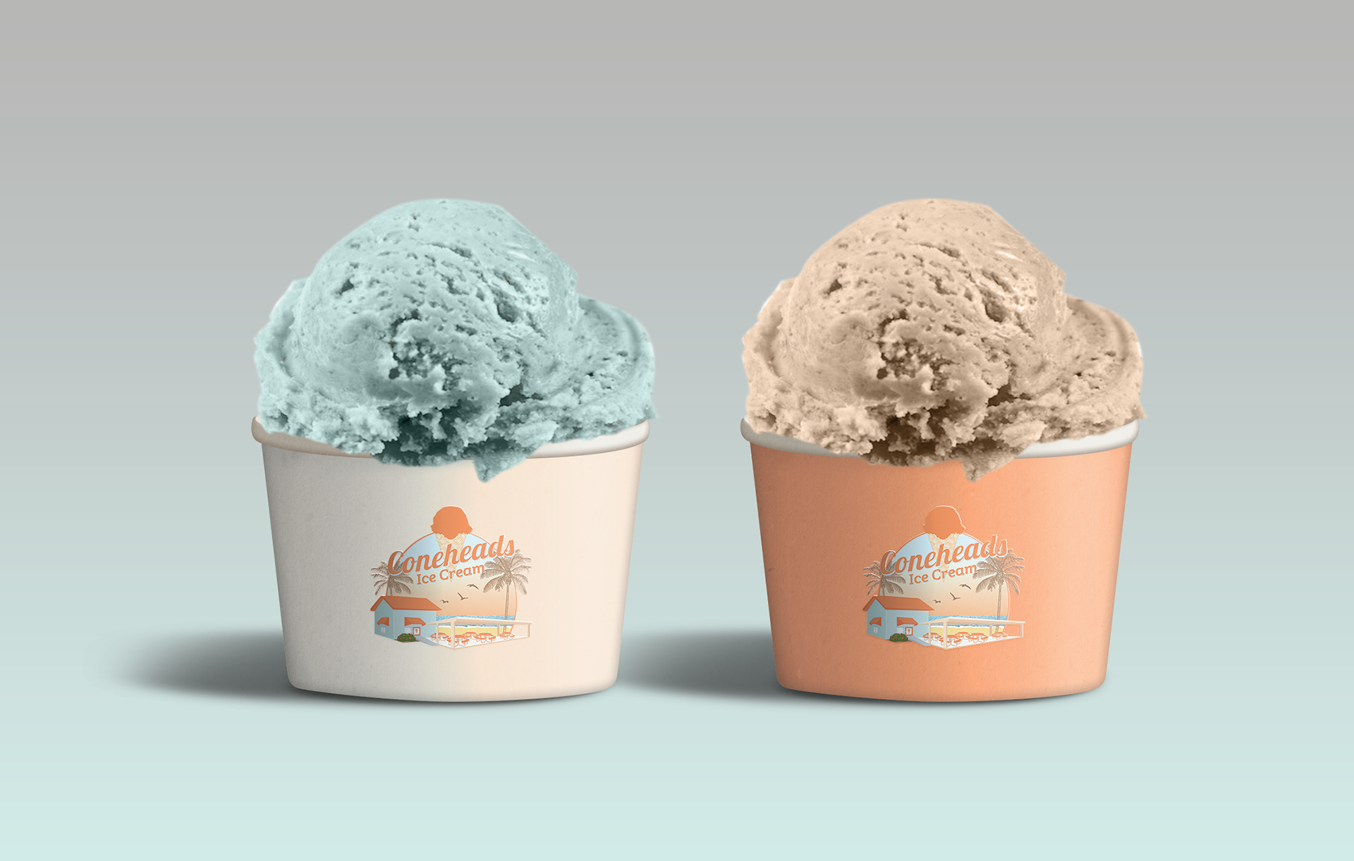
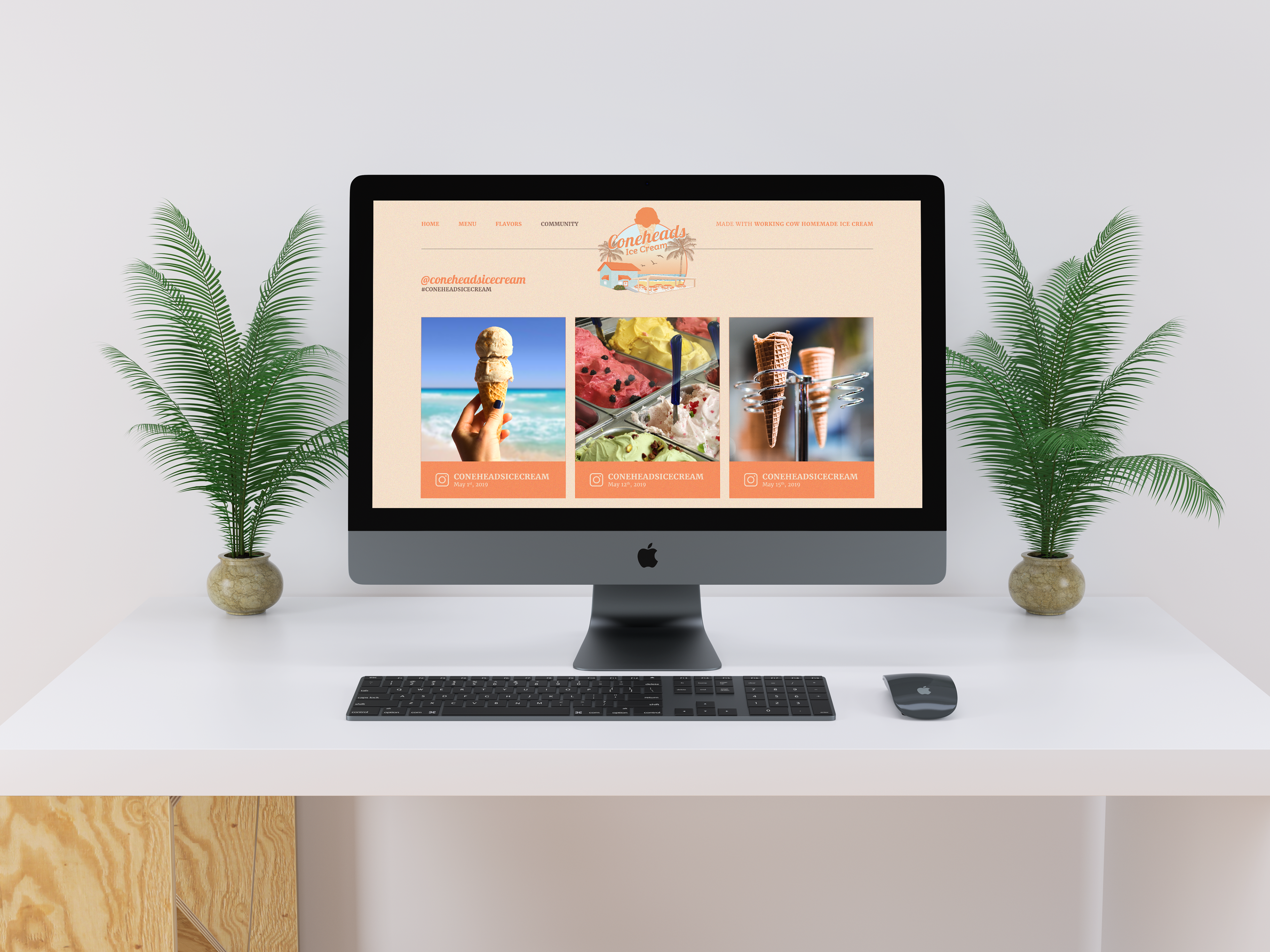
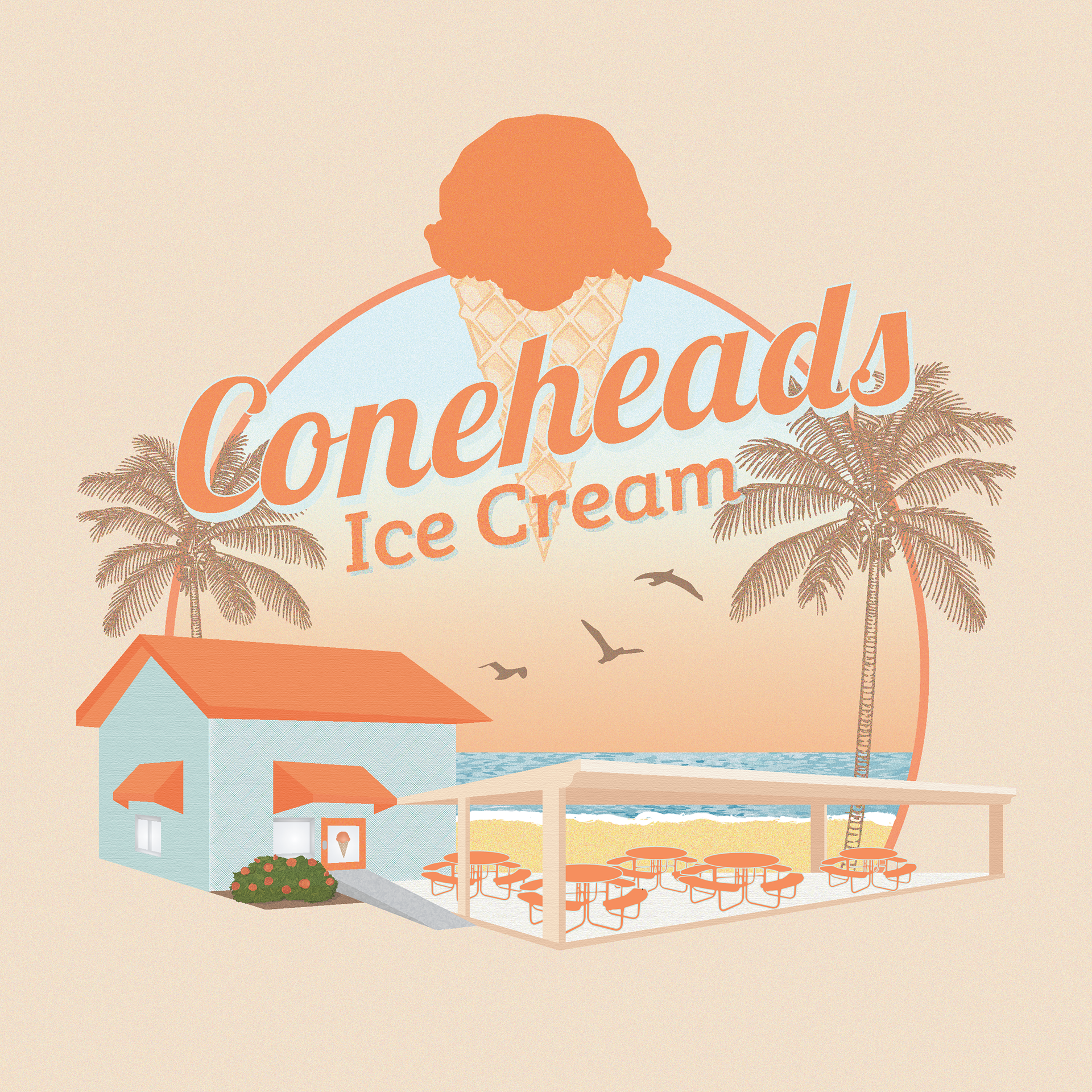
Coneheads is in need of a new logo, a consistent color scheme, a new menu, and a highly visible website to help increase foot traffic. The logo will be visible on a sign outside of the shop, on the uniforms, on the menu, and on the cups/products that are sold within the store. Many other ice cream shops use cool, pastel colors. In order to differentiate itself, vibrant/warm colors will be used to represent Coneheads, which also represents the warm and bright location of the shop: St. Augustine Beach. The main colors used are orange, brown, cream, and light blue highlights. The design style is also meant to be representative of Florida. The design elements work to differentiate Coneheads from chain ice cream shops, since it is only one location/locally owned. In order to achieve this, the logo is an illustrative version of the building itself. The goal of these branding elements are to catch the attention of potential customers that are passing by, whether they are tourists or locals.